Pharmacy Store
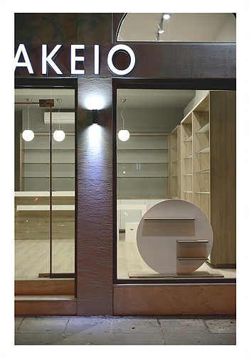
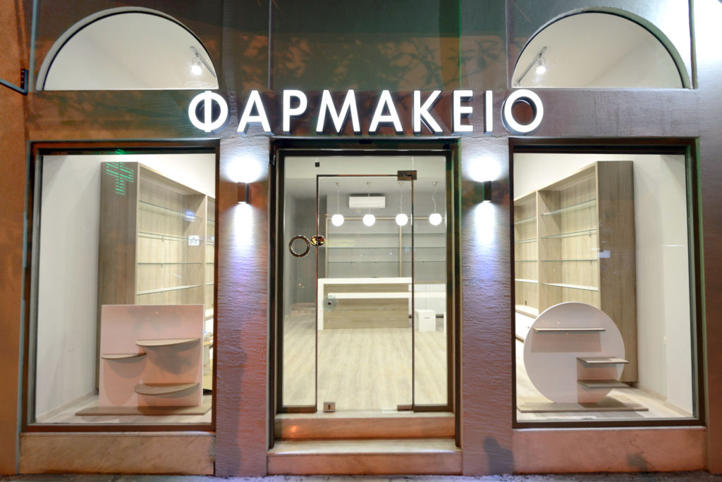
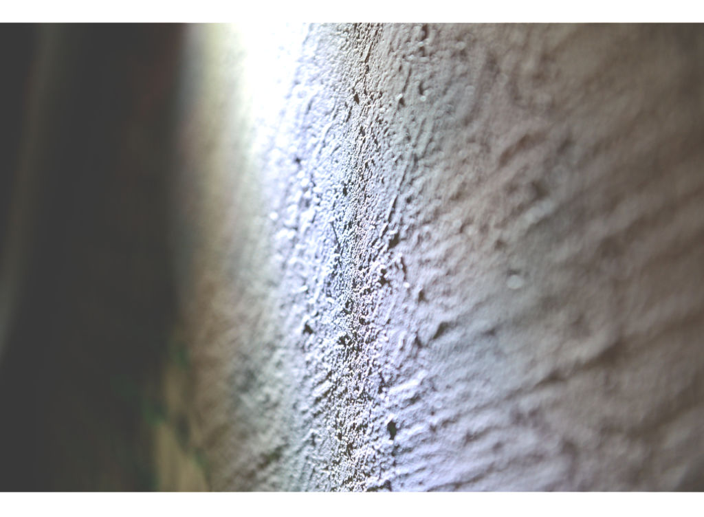
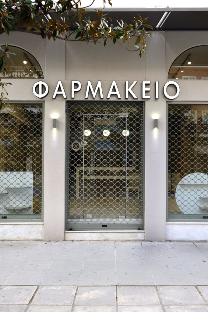
The focal design strategy was an aesthetical approach apart from the typical pharmacy’s green characteristic. So white color become the dominant hue component. The semicircular upper windows were preserved and generated a classic while modern style. The store’s wall facade was covered with a light-colored textured material. Outdoor details like window-frames, glass cover-rolls and lights are painted in a light grey hue. The store’s identity is reflected even in the white illuminated sign on the exterior view. The furnishing was constructed by a local carpenter based on the architect’s plans with oak veneer and white lacquer.
Location
Trikala, Greece
Area_ 70m2
Completed: January 2016
Photos_ DNT Solutions


